Create a UI design system for development in Figma
How to organize UI design system for development in Figma.
Introduction
Creating a design system can be a daunting task for designers especially those who want to try to experiment and brainstorm ideas while they work on building UI.
I used to work on my design projects without worrying about preparation, however, I quickly came to realize the importance of the flexibility of component-driven design systems when I had to make updates on a 100+ screen project. I had to go and change every screen manually it quickly became impossible to be efficient.
The big advantage with design systems using modern design tools like figma or XD is that once you create your components, you make an update on only once. So you don't have to go and update every screen individually.
So how do you start ?
To start, There's no one way to create a design system, Every designer has his own way to communicate with developers.
I personally like to break down my design into components that I keep re-using through my prototypes. Not only to because developers like to think in terms of components but also because it is easier to navigate compared to a 100+ screen prototype.
I usually start with my basic components like colors, typography and slowly move into more detailed components like cards or carousels. And I keep them in separate pages in figma.
1- Colors
Simple components include my colors, typography and Shadow/Effects.
To create a simple component in figma select a layer/frame and find the style that you want to save.
For every project, I use the following structure.
- Primary color for CTAs.
- Complementary colors for backgrounds .
- Whites and blacks for fonts and backgrounds.
For every color, I use a tool called color scale to generate multiple shades that I use in cases like hover or pressed animations.
I also add variations to my white and black color schemes and not limit myself to pure black or pure white.

2- Typography
I start by providing download links and all the other details of the fonts I plan to use. Then I create my text styles.
For each text style I specify the following
- Font size
- Line height
- Letter spacing.
For web project I lay down my text styles in the following structure.
- Headings from H₁ to H₆
- Normal body text.
- Small text.
Tip: if you're designing for web, make sure you add these styles for Both mobile and Desktop. Example H1-Desktop and H1-Mobile.

Shadows and other layer effects
Shadows can give a fake sense of depth and hierarchy between your components like navbar, cards and pop-ups.
I don't create new Shadow for every layer, instead I plan them in advance and same them as layer styles

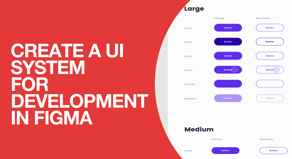
Buttons and inputs
After setting up basic design elements, I start combining them to create your basic buttons and inputs.
Things I usually to include are.
Button variations
- Primary
- Outline
- Inactive
Tips : To create a component in Figma, have the element selected, Click on Ctrl+Alt+K.

Input variations
- Text field
- Text area
- Dropdown
- Radio buttons
- Toggle buttons

Tip: you can use the Variant feature in figma to create hover, 'active', 'inactive' and 'focused' for the elements above
Grid system
Grid is the backbone of your layout, it is very helpful for designers and developers to know the structure of the grid and to keep it consistent throughout the project development. In web projects, I create 3 grids, for Desktop, Tablet and mobile screen.
I show the grid in different breakpoints, Write column with, Gutter etc.
To know more about creating a grid for web project read my post about grids and containers for web.

Core UI Components
I finish by organizing my complex components like Navbars, Cards etc. I organize these elements in a separate page.
In this page, my goal is to help developers understand the visual language and how the design elements blend together to create complex components.
.png")
Final thoughts
After creating your design system, make sure you try to build the habit of sticking to it and not getting carried away by new ideas.
The more you think of design as components instead of screens or pages, the easier coding them in CSS will be.