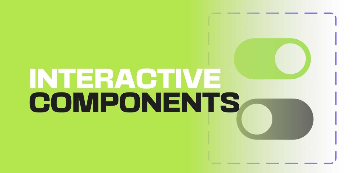
How to create an interactive component in Figma
Interactive components are one of the recent and most welcomed features in Figma. It allows designers to create more interactive prototypes very quickly without adding unnecessary complexity to the design files.
Interactive components are one of the recent and most welcomed features in Figma. It allows designers to create more interactive prototypes very quickly without adding unnecessary complexity to the design files.
Interactive components allow states to the component itself instead of having to create a unique art board just to show a new state. Here some are examples of using interactive components.
- Hover effects for buttons and cards.
- Dropdown and select menus.
- Micro interactions on icons and other components.
- Toggles and switches
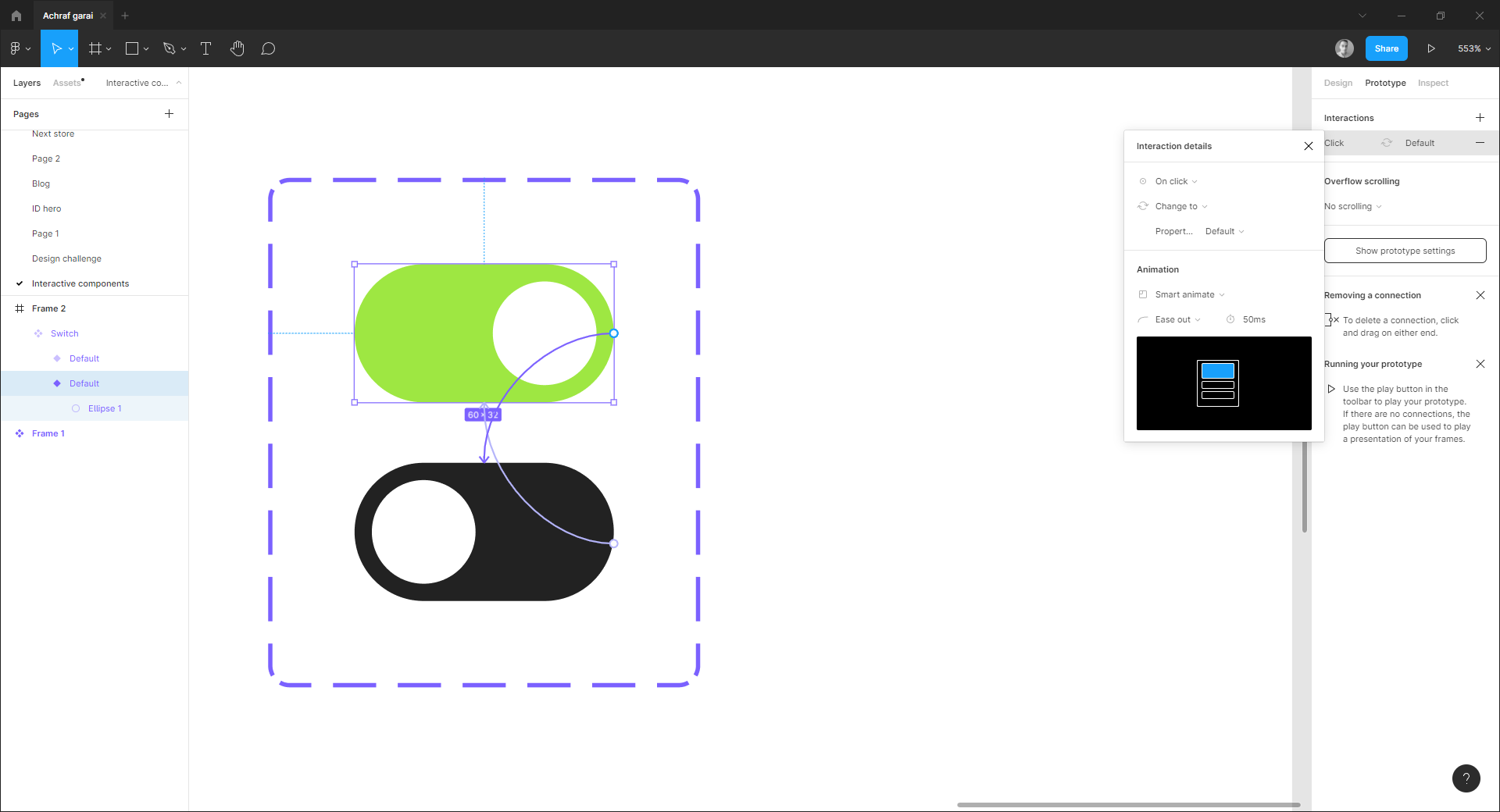
To illustrate how to create an interactive component, I created this basic switch component in Figma.
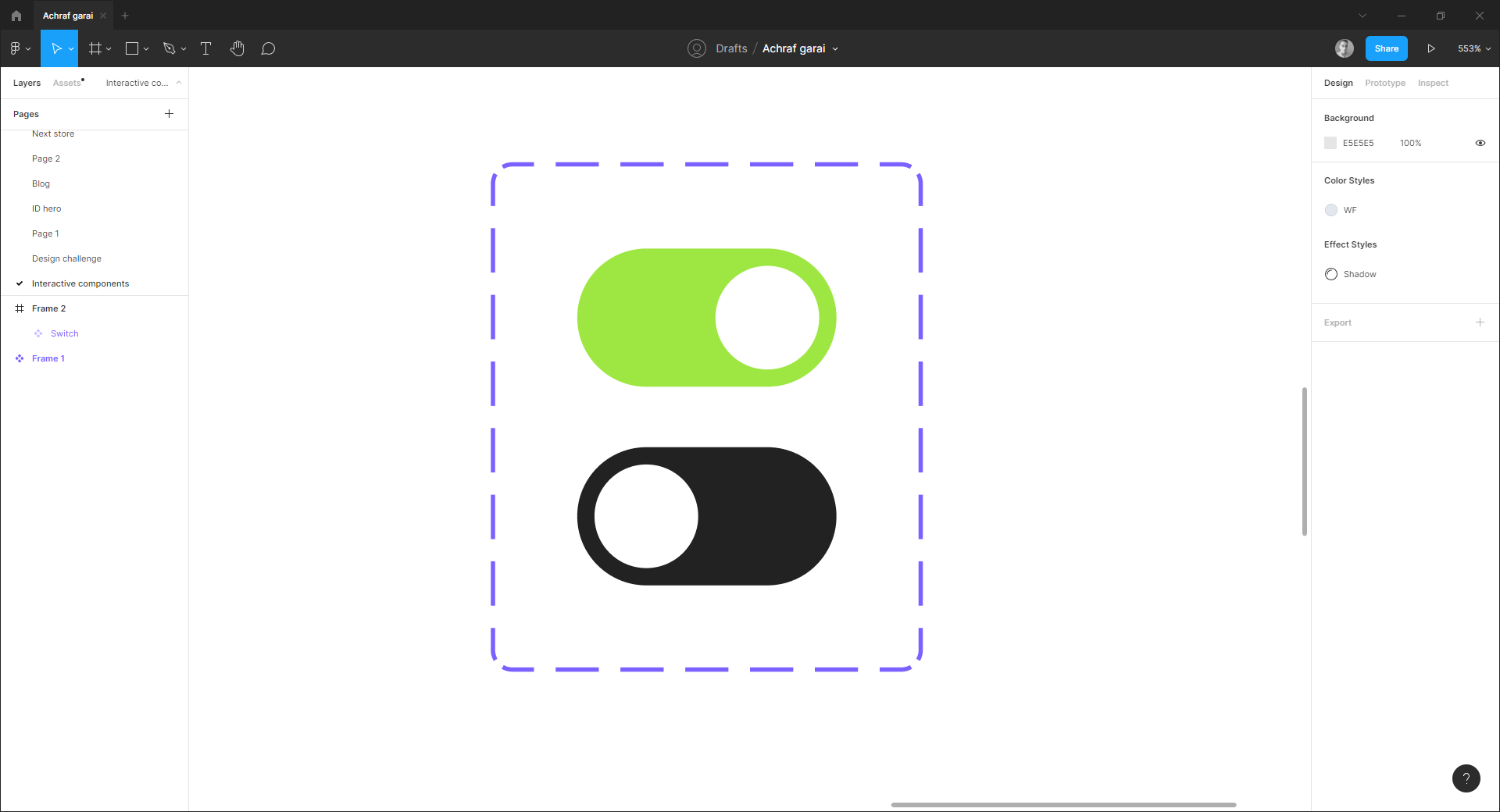
- Click on the + button to add a new variant, and change the design to inactive state.
- Toggle Prototyping tab and connect the components to each other.
- By default, the action is set to on click, this means that our component will transition to the new state once it is pressed. However, if you want your component to transition to the new one on hover (for button components), then switch the action to On hover.
- Set to smart animate for smoother animation.
Now all instances of our switch will have the same interactive properties thought the design.