Designing a scalable design system for a fast-growing startup in Figma
Case study about designing a scalable design system for a fast growing starup. I showcase the process, lessons learned and results.
Working at a leading AI startup, the need for efficient team collaboration and rapid product iteration became evident. To address these challenges, we aimed to develop a scalable design system using Figma, focusing on reducing ideation time, enhancing user experience (UX), and improving developer experience (DX).
Project Goals
- Business: Streamline ideation and development, improve collaboration.
- UX: Ensure consistent user experiences through familiar patterns and accessibility.
- DX: Minimize UI iteration time while maintaining quality.
Team structure
Our team comprised four UI designers and four front-end engineers, collaborating closely with the COO, design, and engineering managers. My role involved planning, designing the system, and coordinating with engineers to align with strategic objectives.
Our Process
The process was iterative, starting with foundational components (primitives) and progressing to complex elements. Each stage involved research, design, and testing.

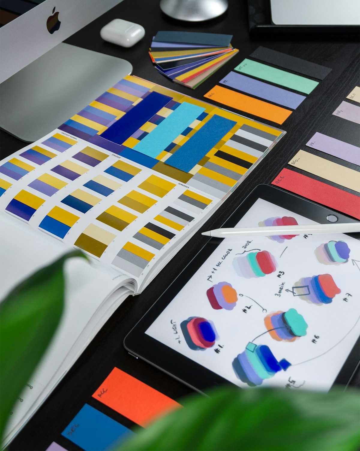
Designing Primitives
We began with essential elements like colors, typography, iconography, and inputs. Ensuring accessibility was crucial, involving:
- Evaluating color contrast.
- Structuring typography for screen readers.
- Collaborating on input accessibility.

- Typography (Text styles for desktop and mobile)

- Iconography


- Inputs (Like buttons, switches, select menus, sliders and drop-down menus)


Accessibility was an important consideration for designing primitives, it involved a lot of collaboration between developers and designers to make sure all elements are accessible. Our process included the following steps :
- Evaluating contrast levels of our color palettes.
- Making sure typography follows correct HTML structure, this makes screen readers.
- Collaborating with engineers to have inputs work with screen readers/ keyboard navigation.
Complex elements
Complex elements were created by combining primitives into customizable components using Figma’s features like nested components and auto-layout. We also implemented variants to facilitate quick component customization.
Making use of variants
One of the important feedback from engineers was to start from a base component and create variants. Each complex element was designed starting from a base variant, and then other variants from the elements were added.

An example is the card component, by default, the components is a card containing an image, a title, and a description. Then, by swapping the card contents, we have a blog card, a user/profile card, a social media card.
In Figma, this was doe using variants, as a result designers can quickly drag and drop components and switch from multiple states and variants.

Developers, however, used a similar approach by implementing each component and a default one, and then adding options to switch variants quickly.
Testing
To test the design system UI, I collaborated with engineers to build a simple UI flow of an app. My goal was to evaluate the system in action and gather feedback by testing the simple app with users.

The criteria of acceptance of each component includes accessibility checks, usability testing with users, testing the workflow with designers and developers and making sure the developer and designer experience is good.
Results and final thoughts
Design systems were a great time investment, and a challenge to implement and test. However, we immediately learned that after using it, not only we harmonized the user experience of the multiple products offered by the company, but we also reduced the time it takes to ship and iterate on new functionalities.