AI Hack - Making a Hackathon Site Memorable Without Getting in the Way
AI Hack is one of the largest AI-focused hackathons in North Africa, held in Tunis, Tunisia. The event brings together tech enthusiasts, developers, designers, and AI experts to collaborate on innovative AI projects.

A space-themed, terminal-driven digital experience for one of North Africa's largest AI hackathons — designed so the spectacle never costs anyone a registration.

At a glance
| Role | UX/UI Designer — research, IA, user flows, interaction & visual design, prototyping |
| Project | Event website (and mobile experience) for AI Hack, a major North African AI hackathon |
| Timeline | 2024 |
The short version: A hackathon landing page has one job — get the right people excited enough to register and informed enough to show up. The team wanted something bold: a space-exploration theme, micro-interactions everywhere, and an interactive terminal you could type commands into. The risk with that ambition is obvious — spectacle becomes friction, and the playful layer gets between a visitor and the Register button. The design problem was making it unmistakably memorable without making it harder to use.
The problem
AI Hack wasn't competing for attention in a vacuum. It needed to stand out in a crowded calendar of tech events and convince developers, designers, and AI folks that this was the one worth a weekend. A generic, clean event template would have been usable and forgettable.
So the brief pulled in two directions at once:
- Be memorable. Distinctive enough that someone who lands once remembers it and tells a friend.
- Be frictionless. A first-time visitor should be able to understand what AI Hack is, find the schedule, and register — fast, without solving a puzzle to do it.
The interesting design work lived in the tension between those two. Most of the project's risk was on the same axis: every delightful, gamified idea was also a potential obstacle. The guiding principle became:
Play is opt-in. The path to "I'm registered" stays straight for everyone.
Research & framing
A few things shaped the direction:
- The audience rewards personality. This crowd builds with terminals and reads release notes for fun. A command-line Easter egg isn't a gimmick to them — it's a wink they'd recognize and enjoy. That insight is what made the terminal a fit rather than a flourish.
- But the audience is also mixed. Not everyone visiting is a developer — sponsors, students, first-timers, and press land here too. Whatever I built had to delight the in-group without alienating everyone else.
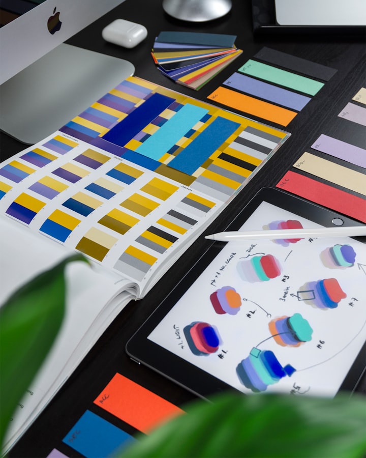
- The cool/clinical "AI aesthetic" is everywhere. Leaning only on blue-purple tech tropes would have read as generic. Tunis has its own visual energy, and folding warm cultural hues into the palette was a way to look like this event and not a stock template.
Key design decisions
Each decision is an answer to the same question: how do we add personality without adding friction?

1. A space theme that carries the whole system — not just the homepage
Rather than decorating one hero section and reverting to a generic layout, I let the space-exploration concept run through the entire experience as a consistent visual and interaction language. That coherence is what makes it feel like a destination instead of a landing page with a nice header.
2. An interactive terminal — as a layer, never a gate
The terminal lets curious users type commands to navigate, uncover hidden information, and reach exclusive content. It's the project's most memorable feature and its biggest usability trap: if discovering the event requires knowing what to type, you've lost everyone who doesn't.
So the terminal sits alongside the conventional path, not in front of it. A first-timer can register and read the schedule through normal UI; a developer who spots the prompt gets a reward for poking at it. Same principle as the registration flow — depth is there for the people who want it, invisible cost to the people who don't.
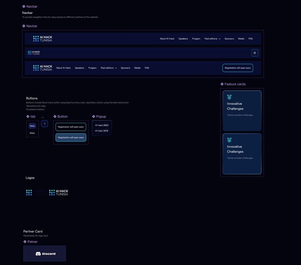
3. Micro-interactions tuned for feedback, not noise
Hover effects, button animations, and loading sequences give immediate feedback and make the site feel alive and responsive. The restraint that matters here is knowing where to stop — motion that confirms an action is useful; motion for its own sake is fatigue.
4. A registration flow that respects momentum
Registration is the conversion. I kept it to clear, visually cued steps so the gamified wrapper never slowed down the one action the whole site exists to drive. The fun is the invitation; the register flow is the handshake — and the handshake stays simple.
5. A palette that says "AI" and "Tunis" at once
Cool tech tones (blues, purples) for the cutting-edge feel, warmed by vibrant cultural hues (reds, oranges) so the event reads as rooted in where it happens. Modern, slightly futuristic type keeps it contemporary and readable at a glance.
Prototyping & testing
I built clickable prototypes to simulate the real interactions — the terminal especially, which only makes sense in motion — and ran usability sessions to find where the playful layer helped versus where it got in the way.
Iteration focused on protecting the straight path: keeping the conversion obvious, making sure the terminal read as optional, and trimming any interaction that turned out to be friction rather than delight.
Outcomes
What I can say with confidence: the design did the hard thing it set out to do — it gave AI Hack a distinct, memorable identity (space theme, terminal, motion) while keeping the core jobs — understand the event, find the schedule, register — fast and obvious for everyone, not just the developers who'd enjoy the terminal.

Reflection
The lesson from AI Hack is that personality and usability aren't opposites — but they're easy to make opposites if you're not careful. The terminal could have been a gate; the space theme could have buried the schedule; the animations could have become noise. The work wasn't adding the fun — fun is cheap. It was layering the fun so the spectacle was always opt-in and the path to registering stayed straight.
That's the discipline I want to keep practicing: design something people remember, without making them pay for it in friction.