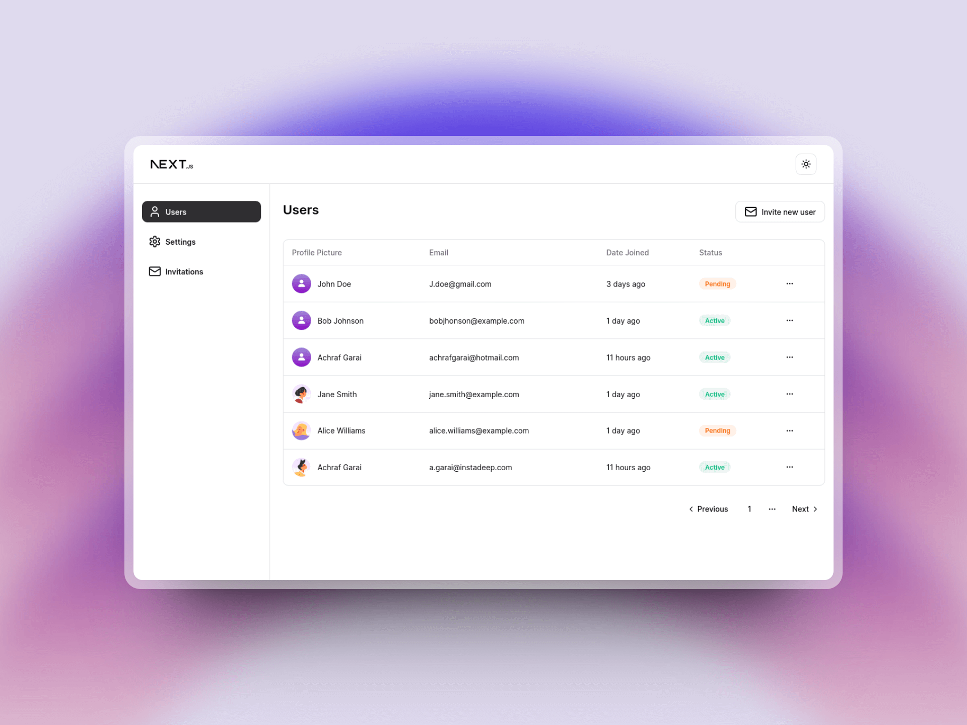
Understanding Shadcn for UI Designers
Designing with Shadcn requires more than just copying components; it’s about understanding its foundation in Radix and Tailwind CSS for accessible, themeable UI. Learn how Shadcn’s structure, semantic theming, and Figma integration help designers create cohesive, adaptable interfaces with ease.

Most design teams today use a component library to streamline the handoff between design and development. This library might be an in-house design system or a pre-configured set of components that serves as the foundation for UI work across an organization.
One of the most popular and rapidly growing libraries is Shadcn. However, designing for Shadcn involves more than just copying components—it requires a thorough understanding of how Shadcn works to maximize its potential in your project.
Technologies
Shadcn is built on top of Radix and Tailwind CSS, two well-known tools in the frontend development world.
- Radix provides base components with accessibility at their core. Shadcn leverages Radix to ensure that all components meet common accessibility guidelines, such as keyboard navigation support.
- Tailwind CSS is a utility-first CSS framework that Shadcn uses to style Radix components. As a UI designer, you can think of Tailwind as the foundational style elements of your design system, much like variables in Figma. Tailwind offers accessible colors, typography, and spacing based on a 8pt scale.
Shadcn combines Tailwind styling with Radix components to create a cohesive set of components, each with built-in animations and styling options. For example, the Shadcn button component includes variables for different styles, such as outlined or secondary versions, allowing for easy customization.
Theming in Shadcn
Shadcn uses semantic theming, making it easy to customize colors across your application with just a few variables. While you can apply any color to a component, the recommended approach is to use Shadcn's predefined semantic colors.
Here’s a small sample of theme configuration:
--primary: 222.2 47.4% 11.2%;
--primary-foreground: 210 40% 98%;
In this example, --primary defines the primary color, and --primary-foreground sets the color for text elements. This approach allows you to quickly create a cohesive theme for your app by adjusting only a handful of variables. Additionally, enabling dark mode is straightforward—simply set new color variables under the default theme:
.dark {
    --background: 0 0% 3.9%;
    --foreground: 0 0% 98%;
}
You can also use this themes tool to edit themes and study the code output to better understand theming.
Exploring Components

With an understanding of theming, let’s look at the button component and see how styling is applied:
variant: {
    default: "bg-primary text-primary-foreground shadow hover:bg-primary/90"
}
In this example, Tailwind utility classes define styling, such as bg-primary for background color and text-primary-foreground for text color. Utility classes like these apply specific CSS attributes to components, creating a flexible and customizable styling system.
In Shadcn, each component can reference a set of styling options from globals.css, where all global theme configurations are managed. This structure makes it easy for designers and developers to work together within a cohesive style framework.

A UI Designer's Approach to Working with Shadcn
To start working with Shadcn, it’s best to begin with the Figma file, which organizes all the fundamental design elements.
Here’s a refined step-by-step guide to start working with Shadcn in Figma, allowing you to quickly align it with your organization’s design language and ensure consistency:
Start with the Shadcn Figma File
Begin by duplicating the Shadcn Figma file, which comes preloaded with essential design elements like typography, spacing, and UI components.
Customize the Base Elements
Update the base elements—such as colors, typography, and spacing—to reflect your organization’s unique design language. This will help ensure your Shadcn components align seamlessly with your brand.
Replace the Icon Set
If your organization uses a custom icon set, replace the default icons in the Figma file with your own. This will maintain consistency across all icons in your design system.
Import Tailwind Colors for Consistency
Use the Figma Tailwind plugin to import your Tailwind color palette directly into Figma. This step will ensure that your design remains consistent with any Tailwind-based code you might use.

Override Configuration Variables
In Figma's Variables tab, override Shadcn’s default colors with those from your imported Tailwind palette or any custom colors. This approach keeps your designs unified and easy to update if your color palette changes.
While this approach works, my preferred way to add custom colors is to extend Tailwinds colors with a new palette, to do this head to variables tab in Figma, go to tailwind colors and add a new color set following tailwind standard color naming by giving the set a name and a value from 50 to 950.

Now simply reference these new colors in your theme configuration.
Set Up Dark Mode
Enable and configure dark mode settings within the Figma file, then preview your design in both light and dark modes. Testing in both modes is essential to maintain visual consistency and readability.

Final Thoughts
Shadcn provides a powerful framework for creating accessible, customizable components. By using Figma’s variable system and a starter template, you can design for Shadcn or any other component library with ease. Just remember to communicate your approach with the frontend team to ensure a seamless design-to-development transition.


